We recently overhauled our internal tools for visualizing the compilation of JavaScript and WebAssembly. When SpiderMonkey’s optimizing compiler, Ion, is active, we can now produce interactive graphs showing exactly how functions are processed and optimized.
You can play with these graphs right here on this page. Simply write some JavaScript code in the test function and see what graph is produced. You can click and drag to navigate, ctrl-scroll to zoom, and drag the slider at the bottom to scrub through the optimization process.
As you experiment, take note of how stable the graph layout is, even as the sizes of blocks change or new structures are added. Try clicking a block's title to select it, then drag the slider and watch the graph change while the block remains in place. Or, click an instruction's number to highlight it so you can keep an eye on it across passes.
We are not the first to visualize our compiler’s internal graphs, of course, nor the first to make them interactive. But I was not satisfied with the output of common tools like Graphviz or Mermaid, so I decided to create a layout algorithm specifically tailored to our needs. The resulting algorithm is simple, fast, produces surprisingly high-quality output, and can be implemented in less than a thousand lines of code. The purpose of this article is to walk you through this algorithm and the design concepts behind it.
Background
As readers of this blog already know, SpiderMonkey has several tiers of execution for JavaScript and WebAssembly code. The highest tier is known as Ion, an optimizing SSA compiler that takes the most time to compile but produces the highest-quality output.
Working with Ion frequently requires us to visualize and debug the SSA graph. Since 2011 we have used a tool for this purpose called iongraph, built by Sean Stangl. It is a simple Python script that takes a JSON dump of our compiler graphs and uses Graphviz to produce a PDF. It is perfectly adequate, and very much the status quo for compiler authors, but unfortunately the Graphviz output has many problems that make our work tedious and frustrating.
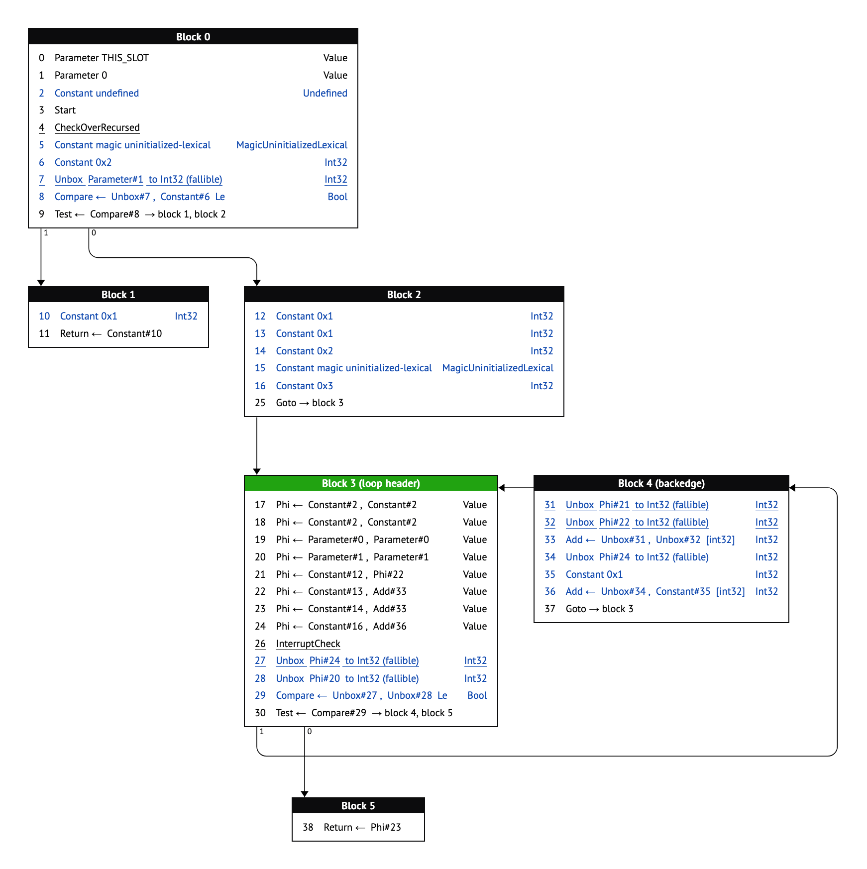
The first problem is that the Graphviz output rarely bears any resemblance to the source code that produced it. Graphviz will place nodes wherever it feels will minimize error, resulting in a graph that snakes left and right seemingly at random. There is no visual intuition for how deeply nested a block of code is, nor is it easy to determine which blocks are inside or outside of loops. Consider the following function, and its Graphviz graph:
function foo(n) {
  let result = 0;
  for (let i = 0; i < n; i++) {
    if (!!(i % 2)) {
      result = 0x600DBEEF;
    } else {
      result = 0xBADBEEF;
    }
  }

  return result;
}

Counterintuitively, the return appears before the two assignments in the body of the loop. Since this graph mirrors JavaScript control flow, we’d expect to see the return at the bottom. This problem only gets worse as graphs grow larger and more complex.
The second, related problem is that Graphviz’s output is unstable. Small changes to the input can result in large changes to the output. As you page through the graphs of each pass within Ion, nodes will jump left and right, true and false branches will swap, loops will run up the right side instead of the left, and so on. This makes it very hard to understand the actual effect of any given pass. Consider the following before and after, and notice how the second graph is almost—but not quite—a mirror image of the first, despite very minimal changes to the graph’s structure:


None of this felt right to me. Control flow graphs should be able to follow the structure of the program that produced them. After all, a control flow graph has many restrictions that a general-purpose tool would not be aware of: they have very few cycles, all of which are well-defined because they come from loops; furthermore, both JavaScript and WebAssembly have reducible control flow, meaning all loops have only one entry, and it is not possible to jump directly into the middle of a loop. This information could be used to our advantage.
Beyond that, a static PDF is far from ideal when exploring complicated graphs. Finding the inputs or uses of a given instruction is a tedious and frustrating exercise, as is following arrows from block to block. Even just zooming in and out is difficult. I eventually concluded that we ought to just build an interactive tool to overcome these limitations.
How hard could layout be?
I had one false start with graph layout, with an algorithm that attempted to sort blocks into vertical “tracks”. This broke down quickly on a variety of programs and I was forced to go back to the drawing board—in fact, back to the source of the very tool I was trying to replace.
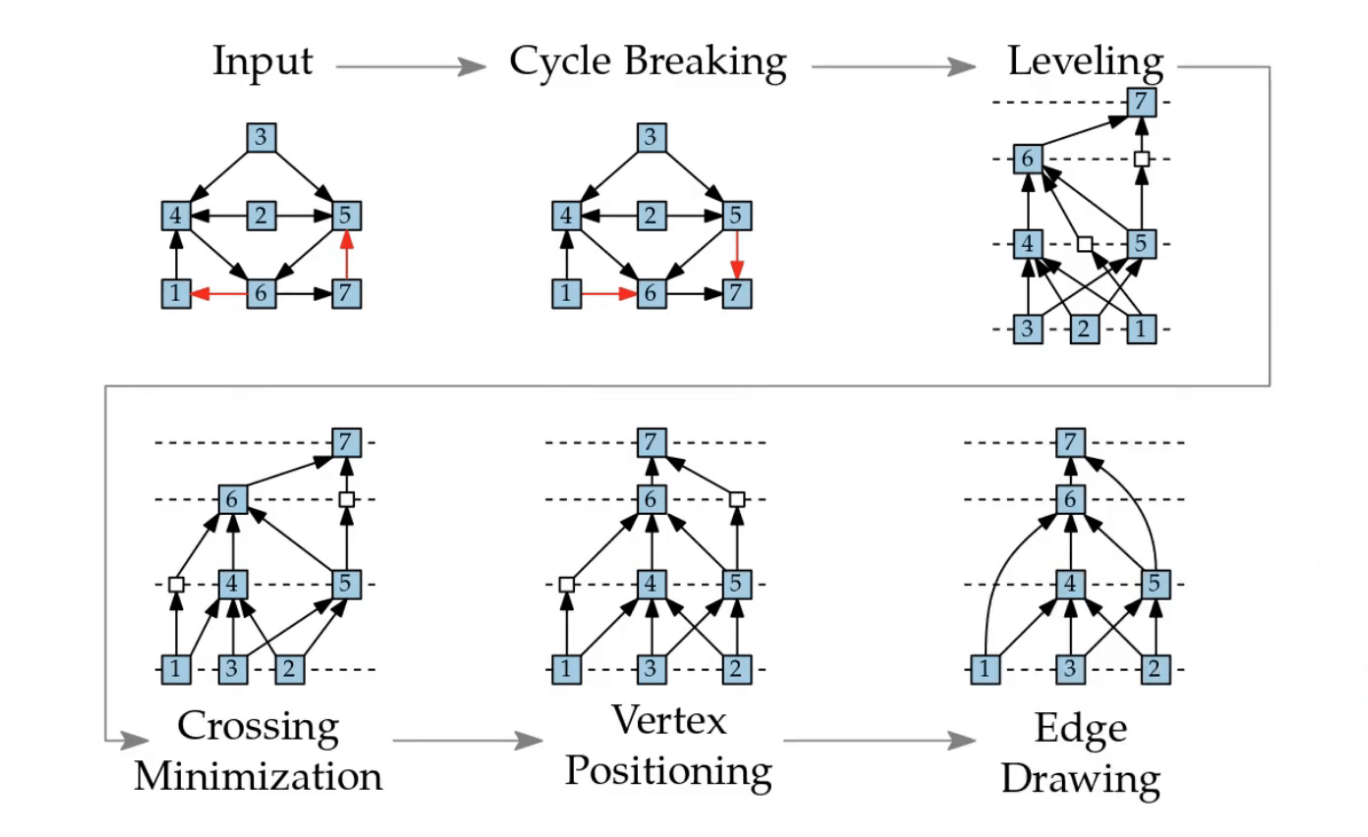
The algorithm used by dot, the typical hierarchical layout mode for Graphviz, is known as the Sugiyama layout algorithm, from a 1981 paper by Sugiyama et al. As introduction, I found a short series of lectures that broke down the Sugiyama algorithm into 5 steps:
- Cycle breaking, where the direction of some edges are flipped in order to produce a DAG.
- Leveling, where vertices are assigned into horizontal layers according to their depth in the graph, and dummy vertices are added to any edge that crosses multiple layers.
- Crossing minimization, where vertices on a layer are reordered in order to minimize the number of edge crossings.
- Vertex positioning, where vertices are horizontally positioned in order to make the edges as straight as possible.
- Drawing, where the final graph is rendered to the screen.
These steps struck me as surprisingly straightforward, and provided useful opportunities to insert our own knowledge of the problem:
- Cycle breaking would be trivial for us, since the only cycles in our data are loops, and loop backedges are explicitly labeled. We could simply ignore backedges when laying out the graph.
- Leveling would be straightforward, and could easily be modified to better mimic the source code. Specifically, any blocks coming after a loop in the source code could be artificially pushed down in the layout, solving the confusing early-exit problem.
- Permuting vertices to reduce edge crossings was actually just a bad idea, since our goal was stability from graph to graph. The true and false branches of a condition should always appear in the same order, for example, and a few edge crossings is a small price to pay for this stability.
- Since reducible control flow ensures that a program’s loops form a tree, vertex positioning could ensure that loops are always well-nested in the final graph.
Taken all together, these simplifications resulted in a remarkably straightforward algorithm, with the initial implementation being just 1000 lines of JavaScript. (See this demo for what it looked like at the time.) It also proved to be very efficient, since it avoided the most computationally complex parts of the Sugiyama algorithm.
iongraph from start to finish
We will now go through the entire iongraph layout algorithm. Each section contains explanatory diagrams, in which rectangles are basic blocks and circles are dummy nodes. Loop header blocks (the single entry point to each loop) are additionally colored green.
Be aware that the block positions in these diagrams are not representative of the actual computed layout position at each point in the process. For example, vertical positions are not calculated until the very end, but it would be hard to communicate what the algorithm was doing if all blocks were drawn on a single line!
Step 1: Layering
We first sort the basic blocks into horizontal tracks called “layers”. This is very simple; we just start at layer 0 and recursively walk the graph, incrementing the layer number as we go. As we go, we track the “height” of each loop, not in pixels, but in layers.
We also take this opportunity to vertically position nodes “inside” and “outside” of loops. Whenever we see an edge that exits a loop, we defer the layering of the destination block until we are done layering the loop contents, at which point we know the loop’s height.
A note on implementation: nodes are visited multiple times throughout the process, not just once. This can produce a quadratic explosion for large graphs, but I find that an early-out is sufficient to avoid this problem in practice.
The animation below shows the layering algorithm in action. Notice how the final block in the graph is visited twice, once after each loop that branches to it, and in each case, the block is deferred until the entire loop has been layered, rather than processed immediately after its predecessor block. The final position of the block is below the entirety of both loops, rather than directly below one of its predecessors as Graphviz would do. (Remember, horizontal and vertical positions have not yet been computed; the positions of the blocks in this diagram are hardcoded for demonstration purposes.)
Implementation pseudocode
/*CODEBLOCK=layering*/function layerBlock(block, layer = 0) {
  // Omitted for clarity: special handling of our "backedge blocks"

  // Early out if the block would not be updated
  if (layer <= block.layer) {
    return;
  }

  // Update the layer of the current block
  block.layer = Math.max(block.layer, layer);

  // Update the heights of all loops containing the current block
  let header = block.loopHeader;
  while (header) {
    header.loopHeight = Math.max(header.loopHeight, block.layer - header.layer + 1);
    header = header.parentLoopHeader;
  }

  // Recursively layer successors
  for (const succ of block.successors) {
    if (succ.loopDepth < block.loopDepth) {
      // Outgoing edges from the current loop will be layered later
      block.loopHeader.outgoingEdges.push(succ);
    } else {
      layerBlock(succ, layer + 1);
    }
  }

  // Layer any outgoing edges only after the contents of the loop have
  // been processed
  if (block.isLoopHeader()) {
    for (const succ of block.outgoingEdges) {
      layerBlock(succ, layer + block.loopHeight);
    }
  }
}
Step 2: Create dummy nodes
Any time an edge crosses a layer, we create a dummy node. This allows edges to be routed across layers without overlapping any blocks. Unlike in traditional Sugiyama, we always put downward dummies on the left and upward dummies on the right, producing a consistent “counter-clockwise” flow. This also makes it easy to read long vertical edges, whose direction would otherwise be ambiguous. (Recall how the loop backedge flipped from the right to the left in the “unstable layout” Graphviz example from before.)
In addition, we coalesce any edges that are going to the same destination by merging their dummy nodes. This heavily reduces visual noise.
Step 3: Straighten edges
This is the fuzziest and most ad-hoc part of the process. Basically, we run lots of small passes that walk up and down the graph, aligning layout nodes with each other. Our edge-straightening passes include:
- Pushing nodes to the right of their loop header to “indent” them.
- Walking a layer left to right, moving children to the right to line up with their parents. If any nodes overlap as a result, they are pushed further to the right.
- Walking a layer right to left, moving parents to the right to line up with their children. This version is more conservative and will not move a node if it would overlap with another. This cleans up most issues from the first pass.
- Straightening runs of dummy nodes so we have clean vertical lines.
- “Sucking in” dummy runs on the left side of the graph if there is room for them to move to the right.
- Straighten out any edges that are “nearly straight”, according to a chosen threshold. This makes the graph appear less wobbly. We do this by repeatedly “combing” the graph upward and downward, aligning parents with children, then children with parents, and so on.
It is important to note that dummy nodes participate fully in this system. If for example you have two side-by-side loops, straightening the left loop’s backedge will push the right loop to the side, avoiding overlaps and preserving the graph’s visual structure.
We do not reach a fixed point with this strategy, nor do we attempt to. I find that if you continue to repeatedly apply these particular layout passes, nodes will wander to the right forever. Instead, the layout passes are hand-tuned to produce decent-looking results for most of the graphs we look at on a regular basis. That said, this could certainly be improved, especially for larger graphs which do benefit from more iterations.
At the end of this step, all nodes have a fixed X-coordinate and will not be modified further.
Step 4: Track horizontal edges
Edges may overlap visually as they run horizontally between layers. To resolve this, we sort edges into parallel “tracks”, giving each a vertical offset. After tracking all the edges, we record the total height of the tracks and store it on the preceding layer as its “track height”. This allows us to leave room for the edges in the final layout step.
We first sort edges by their starting position, left to right. This produces a consistent arrangement of edges that has few vertical crossings in practice. Edges are then placed into tracks from the “outside in”, stacking rightward edges on top and leftward edges on the bottom, creating a new track if the edge would overlap with or cross any other edge.
The diagram below is interactive. Click and drag the blocks to see how the horizontal edges get assigned to tracks.
Implementation pseudocode
/*CODEBLOCK=tracks*/function trackHorizontalEdges(layer) {
  const TRACK_SPACING = 20;

  // Gather all edges on the layer, and sort left to right by starting coordinate
  const layerEdges = [];
  for (const node of layer.nodes) {
    for (const edge of node.edges) {
      layerEdges.push(edge);
    }
  }
  layerEdges.sort((a, b) => a.startX - b.startX);

  // Assign edges to "tracks" based on whether they overlap horizontally with
  // each other. We walk the tracks from the outside in and stop if we ever
  // overlap with any other edge.
  const rightwardTracks = []; // [][]Edge
  const leftwardTracks = [];  // [][]Edge
  nextEdge:
  for (const edge of layerEdges) {
    const trackSet = edge.endX - edge.startX >= 0 ? rightwardTracks : leftwardTracks;
    let lastValidTrack = null; // []Edge | null

    // Iterate through the tracks in reverse order (outside in)
    for (let i = trackSet.length - 1; i >= 0; i--) {
      const track = trackSet[i];
      let overlapsWithAnyInThisTrack = false;
      for (const otherEdge of track) {
        if (edge.dst === otherEdge.dst) {
          // Assign the edge to this track to merge arrows
          track.push(edge);
          continue nextEdge;
        }

        const al = Math.min(edge.startX, edge.endX);
        const ar = Math.max(edge.startX, edge.endX);
        const bl = Math.min(otherEdge.startX, otherEdge.endX);
        const br = Math.max(otherEdge.startX, otherEdge.endX);
        const overlaps = ar >= bl && al <= br;
        if (overlaps) {
          overlapsWithAnyInThisTrack = true;
          break;
        }
      }

      if (overlapsWithAnyInThisTrack) {
        break;
      } else {
        lastValidTrack = track;
      }
    }

    if (lastValidTrack) {
      lastValidTrack.push(edge);
    } else {
      trackSet.push([edge]);
    }
  }

  // Use track info to apply offsets to each edge for rendering.
  const tracksHeight = TRACK_SPACING * Math.max(
    0,
    rightwardTracks.length + leftwardTracks.length - 1,
  );
  let trackOffset = -tracksHeight / 2;
  for (const track of [...rightwardTracks.toReversed(), ...leftwardTracks]) {
    for (const edge of track) {
      edge.offset = trackOffset;
    }
    trackOffset += TRACK_SPACING;
  }
}
Step 5: Verticalize
Finally, we assign each node a Y-coordinate. Starting at a Y-coordinate of zero, we iterate through the layers, repeatedly adding the layer’s height and its track height, where the layer height is the maximum height of any node in the layer. All nodes within a layer receive the same Y-coordinate; this is simple and easier to read than Graphviz’s default of vertically centering nodes within a layer.
Now that every node has both an X and Y coordinate, the layout process is complete.
Implementation pseudocode
/*CODEBLOCK=verticalize*/function verticalize(layers) {
  let layerY = 0;
  for (const layer of layers) {
    let layerHeight = 0;
    for (const node of layer.nodes) {
      node.y = layerY;
      layerHeight = Math.max(layerHeight, node.height);
    }
    layerY += layerHeight;
    layerY += layer.trackHeight;
  }
}
Step 6: Render
The details of rendering are out of scope for this article, and depend on the specific application. However, I wish to highlight a stylistic decision that I feel makes our graphs more readable.
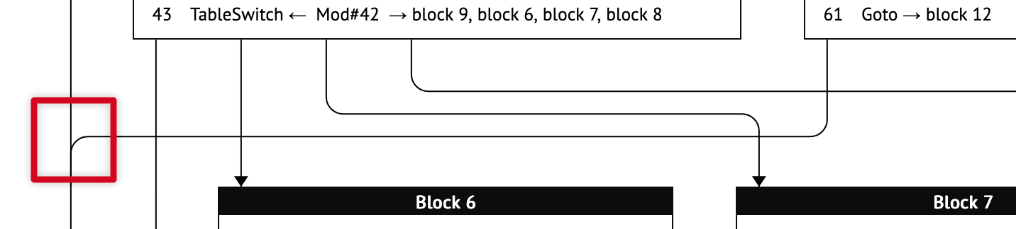
When rendering edges, we use a style inspired by railroad diagrams. These have many advantages over the Bézier curves employed by Graphviz. First, straight lines feel more organized and are easier to follow when scrolling up and down. Second, they are easy to route (vertical when crossing layers, horizontal between layers). Third, they are easy to coalesce when they share a destination, and the junctions provide a clear indication of the edge’s direction. Fourth, they always cross at right angles, improving clarity and reducing the need to avoid edge crossings in the first place.
Consider the following example. There are several edge crossings that may traditionally be considered undesirable—yet the edges and their directions remain clear. Of particular note is the vertical junction highlighted in red on the left: not only is it immediately clear that these edges share a destination, but the junction itself signals that the edges are flowing downward. I find this much more pleasant than the “rat’s nest” that Graphviz tends to produce.
Why does this work?
It may seem surprising that such a simple (and stupid) layout algorithm could produce such readable graphs, when more sophisticated layout algorithms struggle. However, I feel that the algorithm succeeds because of its simplicity.
Most graph layout algorithms are optimization problems, where error is minimized on some chosen metrics. However, these metrics seem to correlate poorly to readability in practice. For example, it seems good in theory to rearrange nodes to minimize edge crossings. But a predictable order of nodes seems to produce more sensible results overall, and simple rules for edge routing are sufficient to keep things tidy. (As a bonus, this also gives us layout stability from pass to pass.) Similarly, layout rules like “align parents with their children” produce more readable results than “minimize the lengths of edges”.
Furthermore, by rejecting the optimization problem, a human author gains more control over the layout. We are able to position nodes “inside” of loops, and push post-loop content down in the graph, because we reject this global constraint-solver approach. Minimizing “error” is meaningless compared to a human maximizing meaning through thoughtful design.
And finally, the resulting algorithm is simply more efficient. All the layout passes in iongraph are easy to program and scale gracefully to large graphs because they run in roughly linear time. It is better, in my view, to run a fixed number of layout iterations according to your graph complexity and time budget, rather than to run a complex constraint solver until it is “done”.
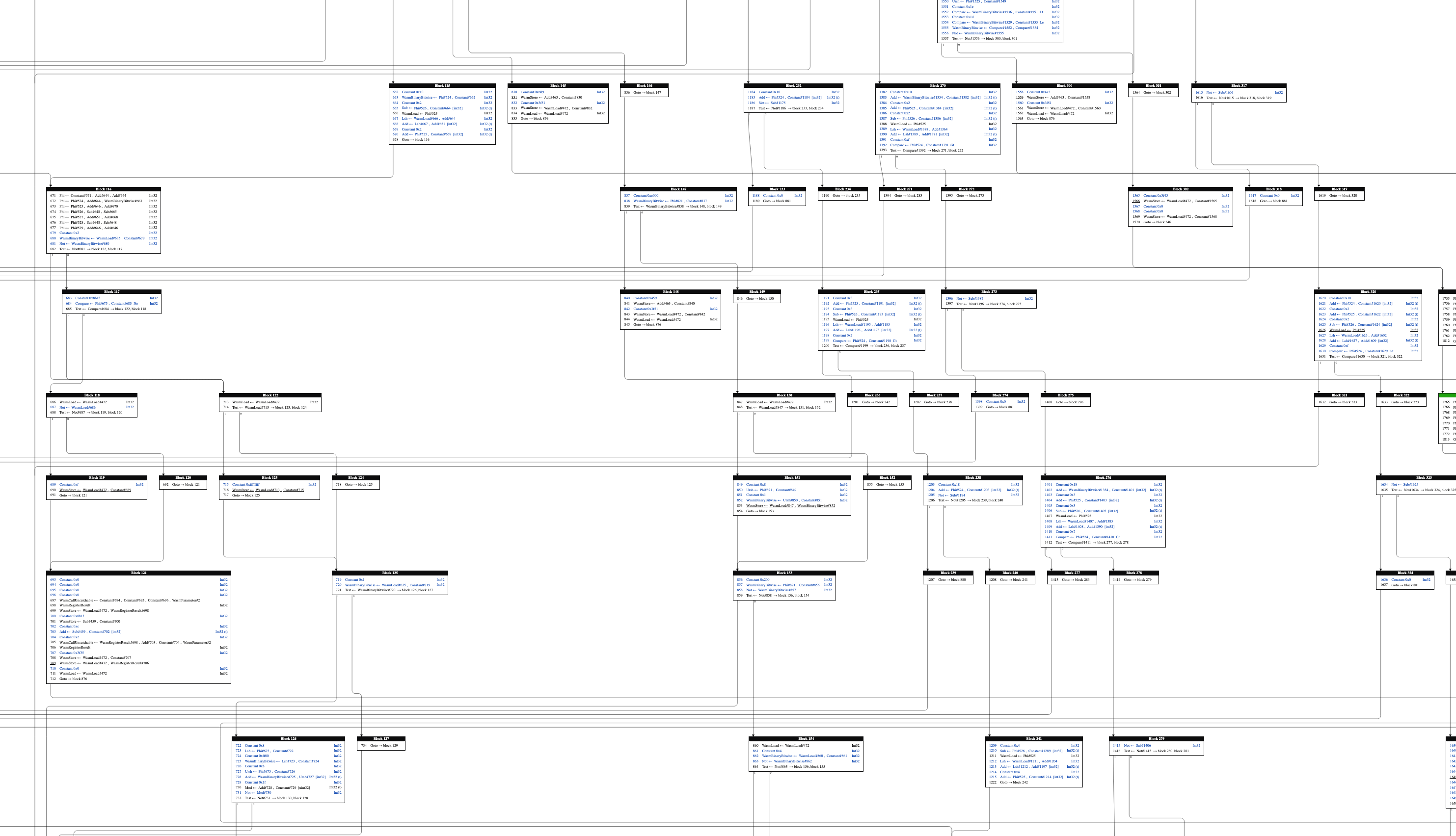
By following this philosophy, even the worst graphs become tractable. Below is a screenshot of a zlib function, compiled to WebAssembly, and rendered using the old tool.
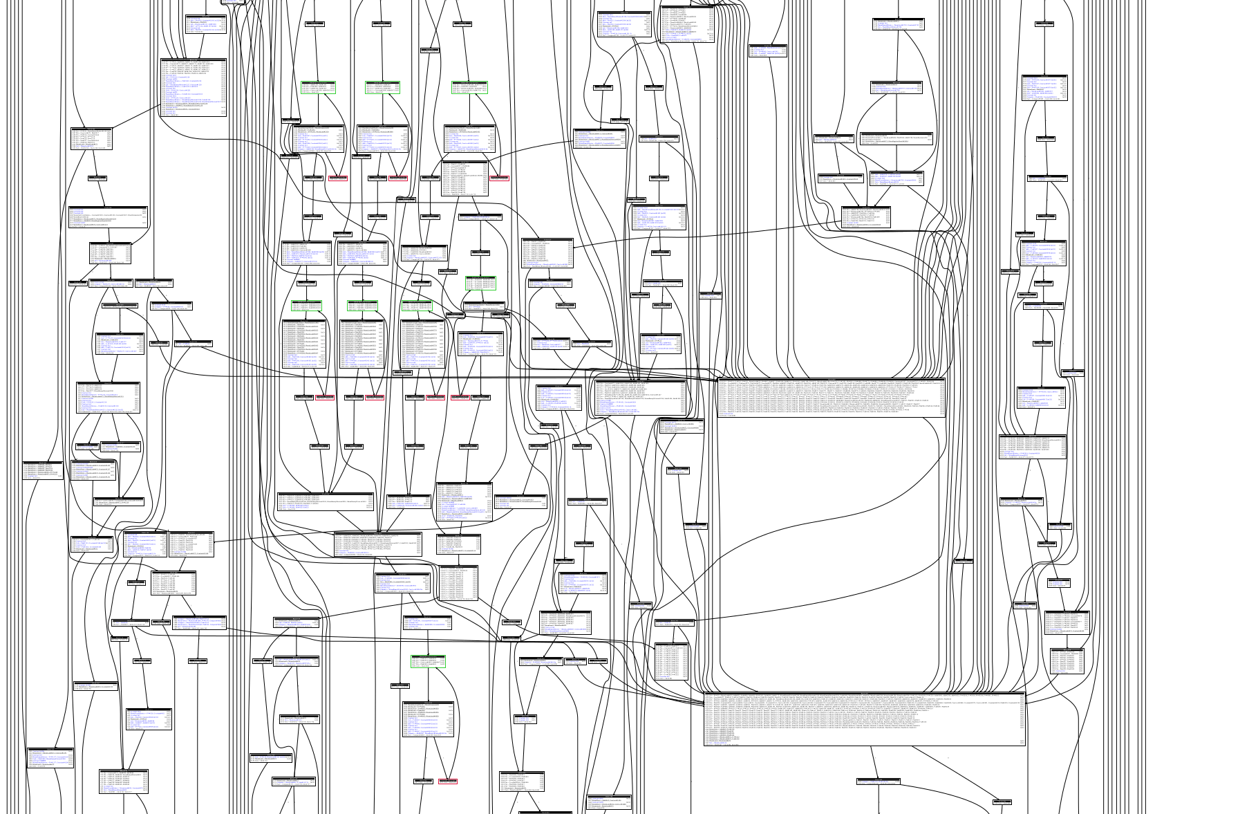
It took about ten minutes for Graphviz to produce this spaghetti nightmare. By comparison, iongraph can now lay out this function in 20 milliseconds. The result is still not particularly beautiful, but it renders thousands of times faster and is much easier to navigate.
Perhaps programmers ought to put less trust into magic optimizing systems, especially when a human-friendly result is the goal. Simple (and stupid) algorithms can be very effective when applied with discretion and taste.
Future work
We have already integrated iongraph into the Firefox profiler, making it easy for us to view the graphs of the most expensive or impactful functions we find in our performance work. Unfortunately, this is only available in specific builds of the SpiderMonkey shell, and is not available in full browser builds. This is due to architectural differences in how profiling data is captured and the flags with which the browser and shell are built. I would love for Firefox users to someday be able to view these graphs themselves, but at the moment we have no plans to expose this to the browser. However, one bug tracking some related work can be found here.
We will continue to sporadically update iongraph with more features to aid us in our work. We have several ideas for new features, including richer navigation, search, and visualization of register allocation info. However, we have no explicit roadmap for when these features may be released.
To experiment with iongraph locally, you can run a debug build of the SpiderMonkey shell with IONFLAGS=logs; this will dump information to /tmp/ion.json. This file can then be loaded into the standalone deployment of iongraph. Please be aware that the user experience is rough and unpolished in its current state.
The source code for iongraph can be found on GitHub. If this subject interests you, we would welcome contributions to iongraph and its integration into the browser. The best place to reach us is our Matrix chat.
Thanks to Matthew Gaudet, Asaf Gartner, and Colin Davidson for their feedback on this article.